Overview
Completed for: Major Project Module as part of the UX Design Masters course at Loughborough University.
Duration: 3 months.
Role: Individual Project
Purpose: Using a human-centered iterative design process, design a research informed digital solution that encourages people to grow their own food at home.
Background
The focus of developing a solution for this project shifted from focusing on the environmental aspect to focusing on the education and experience of growing food at home, which primary research indicated would provide more value to target users.
To align the solution with user goals, development was focused on how a rewarding home gardening experience can be achieved through education, and how people can gain more control over what they eat and support local.
The research stage of this project aimed to identify the barriers that prevent people from growing their own food at home. The purpose of pursuing this research was to explore possible solutions to environmental problems concerning food miles and transparency about the origins of the produce we eat.
To help reduce the environmental impact associated with food production and increase food transparency, people can grow food at home.
Overview of Design Process

Key Insights
Findings from research indicated that there are barriers that dissuade people from growing their own food at home, but there are also factors that encourage people to grow.
Vision Statement
There is an opportunity for a product for apartment dwellers who want to have a rewarding home gardening experience, have transparency about the origin of their produce, and gain the confidence to grow their own food at home but are limited by their lack of knowledge and resources.
Experience Design Principles
Persona
A persona was developed to capture key emotional pain points and goals for users. This persona is used to help create empathy with the target user and to help visualize target users wants and needs to focus subsequent ideation and design.
Concept Generation
How Might We…
Opportunity statements were generated by reframing key insights into actionable How Might We (HMW) statements which helped drive ideation.
HMW statements were generated from each insight and evaluated in a prioritization matrix to identify opportunities that would provide the most value to key target users.
Behavior Change Strategies
Encouraging people to grow food at home involves a shift in behavior, so a second set of HMW statements were generated, this time incorporating behavior change strategies such as feedback, behavior steering, persuasive technology, and gamification. These were also evaluated using a prioritization matrix.
Initial Idea
Three Groups were selected for further development. One idea was sketched and journey mapped but upon evaluation of ideas and discussion with colleagues, I determined that this idea did not align with user needs because it was heavily based on designing a physical structure which was too strongly related to existing products, so it was not developed further.
It would bring no added value to the target user group, so that meant back to the drawing board.
Co-creation
The previous ideation sessions were only completed by a single individual. Therefore, a co-creation ideation and brainstorming session with other designers was completed in order for ideas to be generated collaboratively.
Using the online collaboration tool, Miro, participants were given 5 minutes to engage in rapid ideation using the first insight and HMW statements. They were then asked to think of the craziest ideas possible for two additional minutes. When ideation was completed for this section, they were asked to share their ideas with the group and any additional ideas were jotted down. The same process was undergone for each of the four insights.
How Wow Now
Each participant voted for their top 5 favorite ideas for each insight and 21 of the top voted ideas were put in an evaluation matrix along with ideas from the individual ideation, 71 ideas total.
Three of the top ideas in the Wow quadrant of the How Now Wow matrix were sketched and journey mapped and after discussions with tutors, the idea with the most potential was selected for development.

Initial Concept Statement
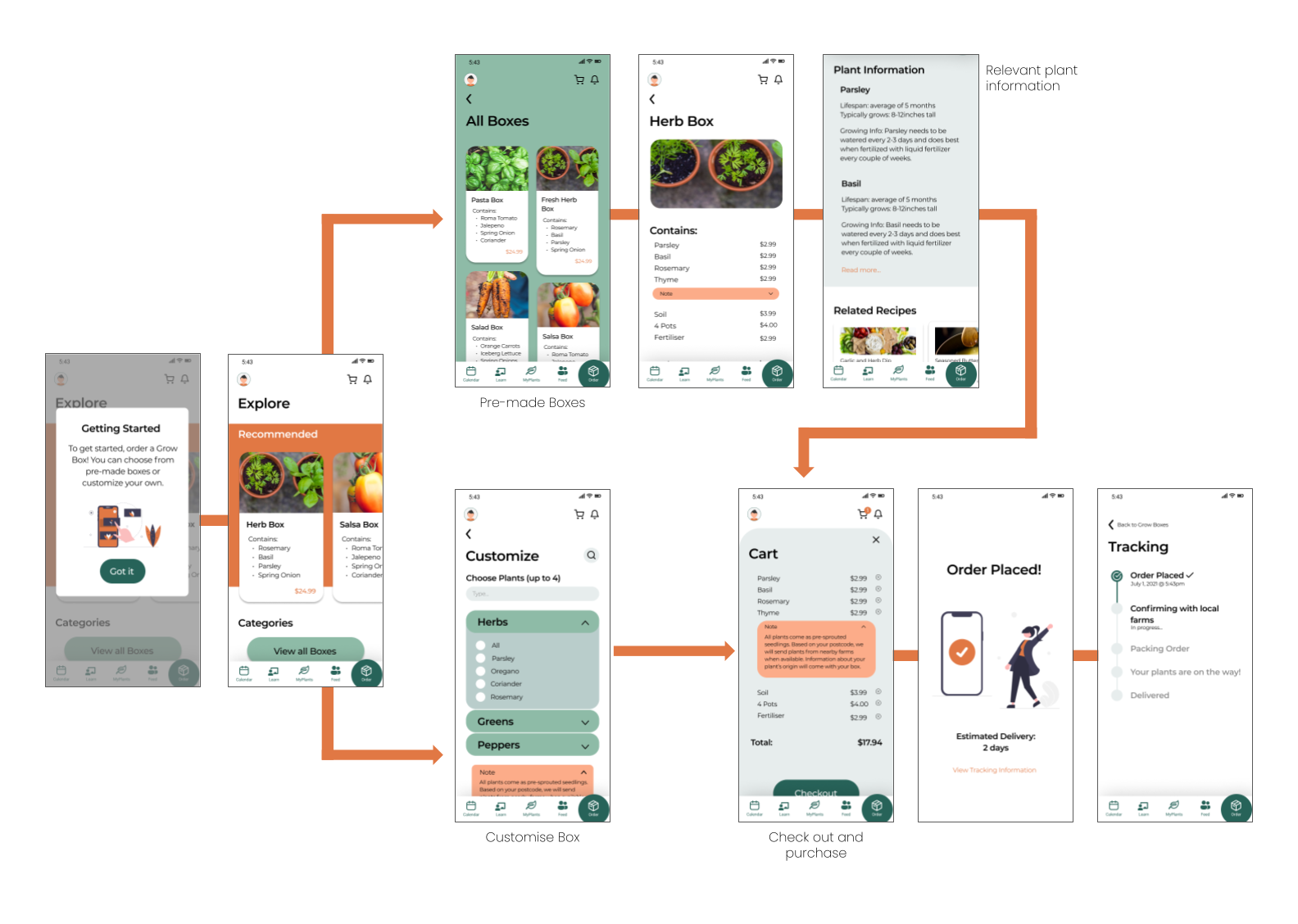
It's Grow Time is an educational app that allows users to purchase produce plants and teaches them how to grow food at home by giving reminders about growing activities and displaying growing requirements for each plant.
User Requirements
MoSCoW
The user requirements generated from the JTBD framework helped the designer identify what features are necessary by mapping features using the MoSCoW method.
The MoSCoW diagram displays features that the design must have, should have, could have, and won’t have and was referenced when developing features to be included in the app. It was also used during prototype development to ensure the outcome was meeting user requirements and goals.
Initial Low-fidelity Testing
During a verbal explanation of a user scenario, prototyped screens were used as supplementary visual aids. The purpose of this was to describe the expected experience and interactions with the app in order to identify if the app and accompanying service aligned with user goals
The most critical feedback in this stage was:
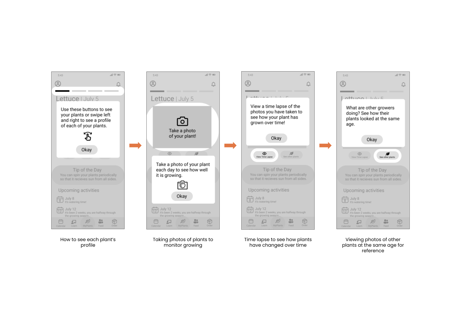
users wanted more emphasis on the social element as they felt that it and the Learn section may not be easily accessible.
being novice growers, they often do not know what their plant should look like at certain stages in their lifespan, and wanted a picture as guidance for how their plant should look.
Key Journeys
Low-fidelity Testing
Low fidelity user testing was conducted to observe how target users interact with the prototype and to ensure that terminology, layout, interactions, and features of the design are understandable.
Five participants were recruited via convenience sampling from various Gardening and Outdoor Facebook Groups for residents in the Pacific Northwest. Interviews were conducted over Microsoft Teams and Zoom.
User Feedback
Hi-fidelity Testing
Observation and think aloud methods were used to test functionality and understanding of the hi-fidelity prototype, and to gauge how well the app aligned with what user wants and needs.
Three participants were recruited via convenience sampling from gardening and outdoor Facebook groups from the PNW. Two additional participants were recruited via snowball sampling. Four additional participants were recruited from Loughborough's UX MA cohort.
User Feedback
Satisfaction
To test user satisfaction of the app’s usability, a 10-question System Usability Scale (SUS) test was given to participants after hi-fi user testing.
Each participant rated the usability on a likert scale from 1-5 where 1 = strongly disagree and 5 = 5 strongly agree. Scores were calculated so that each response was a score out of 100, and these scores were averaged to get the usability score given by each individual. These individual scores were then averaged to get the overall SUS score across all participants.
Based on responses from nine participants, the SUS score was 89.17, which is above the acceptable threshold.
Note: Ideally, another round of user testing and SUS tests would be conducted with a refined iteration of the hi-fidelity prototype, however, this was not possible due to time constraints.
Final Outcome
Video Prototype
Interactive Prototype
Customer Journey
Sitemap
Evaluation of UX Vision
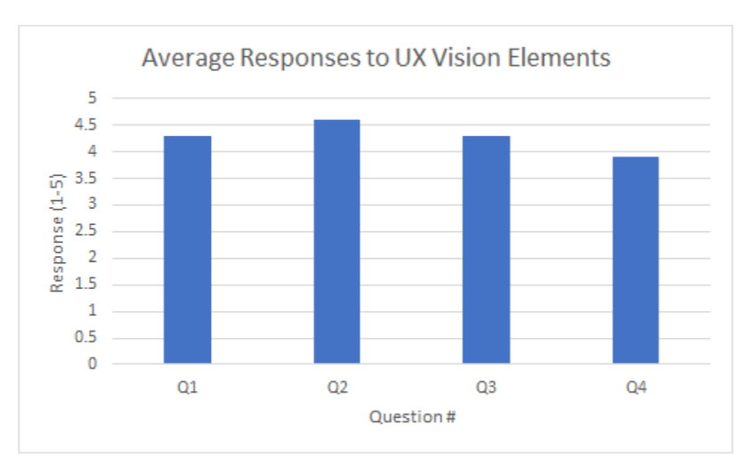
To evaluate alignment of the final solution and the UX vision statement, participants who completed hi-fi user testing answered the following questions on a likert scale from 1-5 (1 = strongly disagree, 5 = strongly agree):
I feel that this app would give me the confidence to grow food at home.
I think that this app would help me learn how to grow my own food at home.
I think that this app would provide me with a rewarding experience.
I think that this app would help me be more aware of where my food comes from.
Each question was targeted at an element of the UX vision in order to identify what can still be improved in the design so that it satisfies the vision. The graph shows that overall, participants evaluated the app highly on all questions, however, there is still room for improvement. Specifically, the app needs to help people be more aware of where their food comes from so this is the most important element to be addressed in future design iterations.


